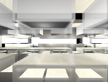
Some recent works update. No, this is not a project for a house (though we wish we could be given a commision to design one), but rather, a work in progress design and fit-out for the Design for Enterprises Center (DFEC) for Design for Enterprises.
DFEC is a national business agency set up to help local businesses understand the impact design has on potential business growth through a network of design initiatives. Essentially this will be a space where business owners are 'matchmade' with respective designers to work with. The functional requirements of meeting, resource, display and temporary exhibition support the ambition of outreach.
Given that the space has a relatively small area of 1000sqft coupled with bad frontage, the most exacerbating aspect is that it is encumbered at high level by mechanical services filling up a large portion of the ceiling. Upon closer study there are several areas where ‘pockets’ of high ceilng can be exploited. Our approach was to find ways to compensate for this lack of.


On a parallel note, continuing typological thinking through our works, we took on the archetype of the house as a physical 'shelter', of which the roof - that which is an overhead covering, becomes the direct determinant of the space below it. 'House' also means to contain, which was kind of apt since it will be the new 'home' for DFEC. We were somehow inclined to think graphically as well - the only other information we had about the space when preparing for the initial design bid were the collaterals which constituted the brand identity of DFEC by Couple - cardboard boxes in the form of 130mm cubes.


 Alongside thinking about creating a new 'House' for DFEC, we devised a 'top down' approach to organising the floorplan. Instead of conventional walls, the new ceiling literally is the element that organises, defines and subdivides the required functional spaces of the DFEC. Gaps in the services zone are exploited for height; the ceiling geometry is characterised by various angular roof pitches to reach the highest apex possible, defining the overall form of the ceiling. Downhang walls and shelving units are suspended from the new ceiling structure, providing display, storage, power and lighting supply to allow clustering of smaller functions.
Working together with our Client DesignSingapore, the required functions are re-programmed into a fluid mix to reflect the feeling of openness. Staff and public mingle while you pick up and browse a product catalogue off the shelf or use the hotdesking area to get infomation off the web. These functional zones can be reconfigured should the need require by sliding the downhang shelves into position. This mobility creates a range of useful scenarios which allows for the changing nature of the center.


[All images by PLYSTUDIO unless otherwise stated]
Expected completion in April 2009. Do check our website for project description.


No comments:
Post a Comment